Creating a dashboard in Tableau
- Jul 16, 2021
- 4 min read
Updated: Jun 1, 2023

In this blog we will learn to make a dashboard in tableau. But before we start, lets discuss what are dashboards and why they are important.
Dashboards
A dashboard is a tool that visually tracks, analyzes and displays key performance indicators (KPI), metrics and key data information to monitor the robustness of a business, department or specific process.
Dashboards can be customized to meet specific needs. Moreover, behind the scenes, a dashboard connects to one's files, attachments, services and API’s, but on the surface displays all this data in the form of various charts and tables.
A dashboard is the most efficient way to track multiple data sources because it provides a central location for businesses to monitor and analyze performance.
Introduction
Before we actually start making a dashboard let's get familiar to some features that Tableau offers.
Sooo, first things first, how do we make a dashboard in Tableau? Well, there are two ways to do that.
Method 1: On the sheet tabs, the last three tabs corresponds to a new sheet, a new dashboard and a new story.
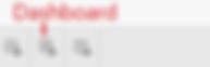
Just click on the 'new dashboard' tab to get to one and that's it. You are where you need to be.
Method 2: Alternately, go to the menu bar and select the 'Dashboard' tab. From the dropdown menu select the 'New Dashboard' option.
Now that we are here, lets explore the Dashboard window a bit more.

In the snap above, we can see that a dashboard is slightly different than a sheet due to the absence of shelves, marks, filters and pages card and a difference in the side pane on the LHS. Also, the view area has also changed.
On the LHS of the dashboard window, the Data/Analytics pane is replaced by the Dashboard/Layout pane. The Dashboard pane offers various functions that are useful when creating a dashboard.
The first option it offers is to set the view size according to the device that would be used for viewing the dashboard. We can set the dashboard size to a desktop, phone or tab screen for an apt visualization.

If you are not able to decide for a view size, you can select the 'Automatic' option under the 'Size' section in the dashboard pane. By doing this, tableau will automatically change the dashboard size according to the device.

Moving further down in the pane, we see the 'Sheets' section which lists all the sheets that you have made in your workbook. You can drag these sheets to the 'Drop sheets here' area in order to add the desired chart to your dashboard as shown below.

At the very bottom we have the 'Objects' section. Using this section you can insert images , text etc. or set the orientation of the view. Just try your hand at all these options one by one to get the hang of it.
Then comes the 'Layout' pane. It contains option to edit the layout of the dashboard and the selected charts such as adding borders, font settings, etc.
The introduction ends here, now we will start making the dashboard. Along the way we will explore more features.
Creating a dashboard
The dataset used for creating the charts and dashboard is the 'Superstore Dataset'. Please download the dataset from below.
Moreover, we wont be creating the charts again in this tutorial. But you can always go back to the previous blogs for a refresher.
As we have already discussed in the introduction section above, to make a dashboard we just need to drag the sheet containing the required chart onto the canvas or the view area.
By default the canvas type is 'Tiled' so you just need to keep dragging and dropping the sheets on the area of the chart where you need them and Tableau would adjust the sizes of the chart. You can also resize them manually if you want. The process is shown below.

Here, the color scales were removed as the viewer will understand the color scheme by themselves while looking at the graph so keeping it would have been redundant. But its up to you whether you want to keep it or not.
Alternatively, if you select the canvas type to be 'Floating' and then drag the charts on the canvas then you will have to resize them yourself in whatever fashion you like. Try it out yourself.
Moreover, you can also use a chart as a filter for other charts. Let's do this with the fill map showing the sales by region. When you select the chart, you need to click on the 'Funnel' icon that shows up on the RHS of the chart or you can click on the dropdown icon and select the 'Use as filter option'.

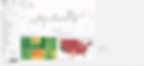
Notice how when you select a particular state in the fill map the other two charts changes to reflect the sales of that state. You can also choose to reflect these changes in specific charts but that's discussion for another time.
We will stop here for now. In the next blog we will discuss more about dashboards.
You maybe interested to check out the following blogs:
If you need implementation for any of the topics mentioned above or assignment help on any of its variants, feel free to contact us.
