Getting started with Tableau
- Jun 22, 2021
- 5 min read
Updated: Jun 1, 2023
Tableau is a very powerful and fast growing data visualization tool used in many industries. It helps in simplifying raw data into a visual format which is very easy to understand at the first glance.
Tableau helps to create stories describing the data that can be understood by professionals at any level in an organization. The great thing about Tableau is that it doesn't require one to be from a technical background to work with it. It allows non-technical users to create customized dashboards. Thus this tool has garnered interest among people from all sectors such as business, researchers, different industries, etc.
What makes Tableau stand out from the rest is that data analysis is very fast with it and the visualizations created are in the form of dashboards and worksheets.
Let's introduce you all to this wonderful tool.
If you don't already have Tableau installed, please download it by referring to this blog.
The first screen that appears when you open Tableau is it's start screen.
On the left hand side of the start screen you get options to load data in various formats such as Excel, Text, JSON, Pdf files etc. or you can load data directly from a server as well. Here, you can also find dataset that comes with Tableau so that you can explore various functions of the tool.

On the right hand side there are several tutorial videos to help you get started with this tool.
Loading Dataset
In this tutorial we will work with the superstore dataset. Although it is already available in Tableau please download it from below here since some changes have been made to it for the purpose of this tutorial.
NOTE: Please get familiar with the dataset. All the column names are self-explanatory.
Our dataset is an Excel file therefore on the start screen we will click on 'Microsoft Excel' , in the dialogue box that pops up go to the directory containing the dataset file.

Once you open the dataset, another page appears that let's you know that the data set is now connected.

Here you can also see the name of sheets ('Orders', 'People', and 'Returns') available in this file on the left hand side under a tab named 'Sheets'. You can also preview the data before getting things started, by dragging the sheets to the 'Drag sheets here' space on the screen.
You can also perform various join and sort operations on the data according to your needs in this space and preview it.


NOTE: We won't be performing join on our data in this tutorial, since we don't need it.

Even at this point you can add more data by clicking on the 'add' button near the 'Connections' tab.
Congratulations! we have reached our first milestone.
Worksheets
Now, that we have loaded and viewed our data, we have reached the point where we can mold it to get some information out of it. The work space in Tableau is called 'Worksheet'.
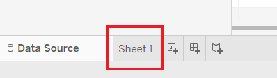
In order to navigate to the worksheet you need to click on the 'Sheet 1' tab on the bottom left corner of the screen. (And just so you know, you can also change the name of the sheet by right clicking on it and then selecting the 'Rename' option, the same way as in Microsoft Excel.)

The above picture names various sections of the worksheet.
The topmost bar displays the name of the workbook. A workbook contains sheets. A sheet can be a worksheet, a dashboard, or a story.
From the Toolbar we can access commands and analysis and navigation tools
In the Cards and Shelves workspace area we drag fields to add data to a view.
The View area is the canvas in the workspace where we can create a visualization (also referred to as a "viz").
On the side bar there are two panes, namely, Data pane and Analytics pane. In the Data pane there are two section: dimensions and measures, which groups together qualitative and quantitative fields in the dataset respectively. Also, the different icons in green and blue corresponds to different data types. Even the colors of the icon are significant, blue colored icons tells us that the data in the field is discrete where as green colored icons tells that the data is continuous in nature.

Sheet tabs represents each sheet in a workbook. This can include worksheets, dashboards, and stories.
Status bar displays information about the current view.
You now have all the basic information and are just one step away from creating visuals. We have just passed our second milestone!
Creating Charts
We will create a sales trend chart using the superstore data.
One thing to note is that, the x and y axes are represented by columns and rows in Tableau workspace. To create a sales trend chart we want the Dates on the x-axis and Sales on the y-axis. Thus, we will drag the Dates field from the Data pane to the columns shelf and Sales to the rows shelf.
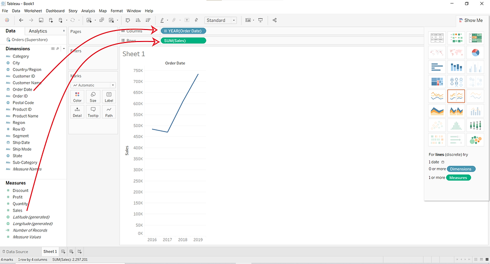
So, we just created a line chart.
But, is that it?
Well, yes! it's pretty easy right? But wait. We are not done yet.
In the above picture we can see that on dragging the required fields into the columns and rows shelves, an yearly sales trend chart was made. But what if we want to dig deeper to get more insight from the data?
To do that, we will click on the '+' sign before the YEAR field in the columns shelf.

This makes the chart appear like this:

Clicking on the '+' sign transforms the chart into a quarterly sales trend per year.
Let's click on the '+' sign before the QUARTER field in the columns shelve.
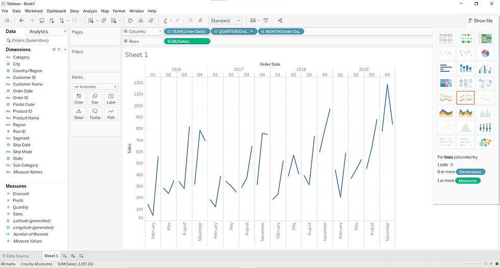
Well, this gives us a more detailed monthly sales trend chart. But there are several discontinuities in the chart. Why is that? Any guesses?
(HINT: the colors are telling you something!)
I hope you guessed it right. The data fields are blue in color which tells that these fields are discrete in nature, thus the presence of discontinuity in the chart. To resolve it, we will first click on the '-' (minus) sign before the YEAR and QUARTER fields which will bring us back to square one.

Then, we will click on the downward facing arrow on the right side of the YEAR field. This will open a dropdown list with several options. We will select the "YEAR" option in the continuous variables section to make the data in this field to be treated as continuous.

Doing this makes the field continuous and thus the color of the YEAR field in the columns shelve changes from blue to green. Now if we click on the '+' sign again as we did above, we will get the following visuals.

One more way to bring the same change is shown below, where we change the 'Order date' field in the Data pane from discrete to continuous variable before dragging it to the column shelf.

We can change the color , size, label, style of the chart using the Marks card at the left of the View.
We can also change the type of chart using the 'Show me' tab in the top right corner of the worksheet. We will explore these charts in the coming blogs.
One last lesson before we part ways: To make chart reading easier and more accurate, Tableau offers 'Tooltip'. If you hover the pointer over the line in the chart, it will show you the value of the x and y axes.

A nice and detailed chart is a click away. You have achieved your goal, now you can rest and rejuvenate to walk yourself through another blog.
In the upcoming blogs we will explore more of Tableau, so keep an eye out for it.
Until then,
If you need implementation for any of the topics mentioned above or assignment help on any of its variants, feel free to contact us.


Comments