Tableau Charts (Part I) : Bar Graphs
- Jun 24, 2021
- 4 min read
Updated: Jun 1, 2023
In this blog we will learn to create different types of charts in Tableau.
If you are new to Tableau, you may want to learn the basics from this blog.
We will be using the Superstore dataset. Although it is already available in Tableau please download it from below here since some changes have been made to it for the purpose of this tutorial.
Now we will load the data into Tableau and drag the 'orders' sheet to the 'Drag sheets here' space on the screen. We will then navigate to our playground i.e. the worksheets.
All these steps are discussed in detail in the previous blog mentioned above, in that blog we made a simple line chart of sales trend.

Let's see how else we can visualize the same data in a different manner. We will also explore some more features of Tableau.
Bar charts
Bar charts are diagrams in which the numerical values of variables are represented by the height or length of lines or rectangles of equal width.
They are used to compare things between different groups or to track changes over time.
First we drag the required fields: 'Order Date' and 'Sales' to the columns and rows shelves respectively.
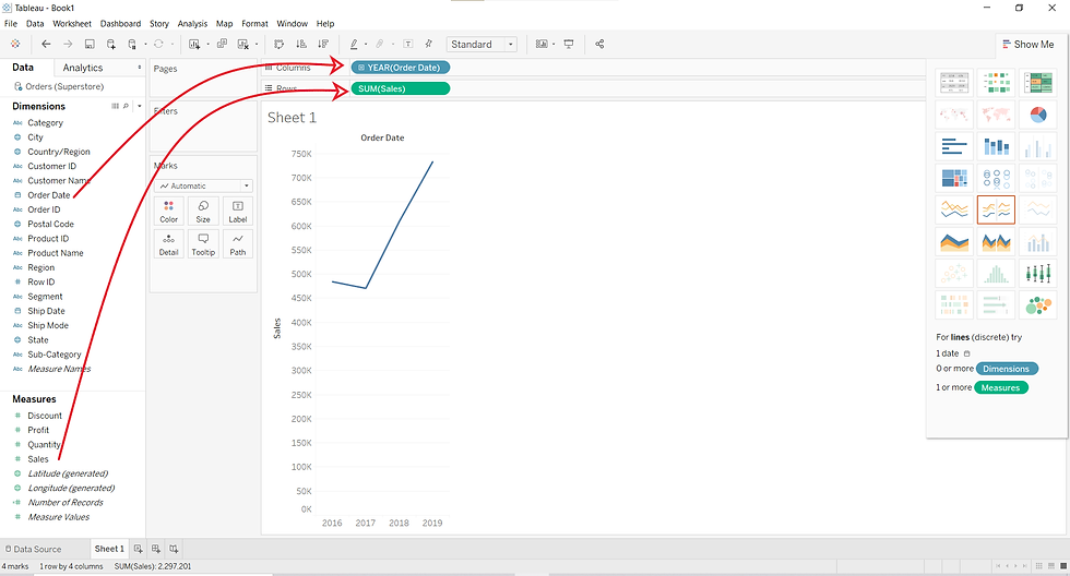
What we now have is a line chart since this is the default chart in Tableau.
To convert this chart into a bar chart, click on the dropdown menu and select the 'Bar' option. In the dropdown menu there are various other options to select from you can try them as well.


If we expand the Order Date field in the columns shelve by clicking on the '+' sign on the left of the 'Order Date' button or by selecting categories ( i.e. Quarters, Months, Weeks etc.) from the dropdown menu by clicking on the right of the 'Order Date' button. More details would be added in the graph as shown below.


Panes
In the graph, as you keep increasing the details you see that a grid appears. There are many panes in it. These panes would correspond to the 'Year', 'Quarters' and 'Months' in this case. Generally, these sections represent the fields that have been expanded.
If you click on one of these panes, a box would appear using which you can either only keep that particular pane or remove it.

You can also expand the chart in the view to fit the whole area. This can be done by clicking on the dropdown menu in the toolbar and selecting the option as per your requirement. One example is shown below.

The chart now covers the entire view area.
COLORS, SIZES and LABELS
This section will deal with makeover of the charts to make them aesthetically nice.
We will change the color and size of the chart. We will also, add labels to the chart that would help us to read it accurately.
Let's begin...
Color
To change the color of a chart we can use the 'Color' mark. Just click on the 'Color' mark and then select the color for your chart. You also get the option to select the extent of opacity and you can also add borders to you chart.


We can also add more details to the chart and use separate colors for them. To visualize this we will drag the 'Category' field from the Data pane and drop it on the Color mark as shown below.

This introduces the 'Category' field in the chart and each unique category gets it's own color which makes it easier to understand the Sales trend in terms of 'Category'.
Notice that on doing this a legend appears on the extreme right of the view area which also gives an option of toggling between highlight and no-highlight mode.
If the highlight mode is on and you click on a category in the legend, then the region corresponding to that category will be highlighted in the chart.
If the highlight mode is off then no region gets highlighted in the chart

You can also change the color of each Category using the Color mark option.

The 'Category' column we used in the above examples is a Discrete column. What if we drag a Continuous column to the Color mark? Try it yourself and find it out.
Sizes
We can increase and decrease the size of chart objects ( 'bars' in this case) using the 'Size' mark.
Moreover, instead of different colors we can make use of different sizes to differentiate between different categories. We just have to drag the field to the 'Size' mark.

Labels
Adding data labels to a chart makes it easy to read and brings our attention to the numbers from the source data. It adds more detail to a chart.
We can add data labels by clicking the 'Label' marks and then selecting the 'show mark labels'.
We can also add labels corresponding to different categories by dragging the Category column/field to the 'Label' mark. If we drag the Category column to the 'Label' mark then data labels will be added to each category. This is shown below.
Another way to do the same is as follows.
The 'Label' marks also gives us options to change the font and alignment of the Label text.
The 'Marks to Label' section allows us to select the marks on which the labels should appear. If we choose:
'All': labels would appear on all marks.
'Min/Max': label would appear on the marks corresponding to maximum and minimum values only.
'Most Recent': labels would appear on the marks corresponding to the most recent time.
'Selected': labels would appear only on the selected marks.
'Highlighted': labels would appear only on the marks which will be highlighted using the legend.
That's all for today. See you later.
If you need implementation for any of the topics mentioned above or assignment help on any of its variants, feel free to contact us.


Comments