Data Visualisation Tools
- Sep 14, 2020
- 12 min read
Updated: Sep 17, 2020

What is Data Visualisation?
Data Visualisation is the graphical representation of the data to infer some insights from it. It allows us to comprehend complex relationships within the data. It is also called information graphics.
The main goal of data visualisation is to make it easier to identify patterns, trends and outliers in large data sets. It is one of the crucial element in Data Science processes, after the data has been collected, processed and modelled it must be visualised to make conclusions. Data visualisation holds value in other fields as well such as in teaching field teacher can use it to get a visual measure of student's performance, it can be used in businesses to see the trends and make decisions, it can be used by the govt. to keep record of changes in the demographics of a place etc. In today's time there is almost no limit to the use of data visualisation.
Why data visualisation?
We all know that we are living in a digital era where almost everything has gone digital whether it may be shopping, banking, entertainment or education. With such a large population as consumers, a very large scale of data (of the order of trillions) is generated everyday. It is simply not possible to look at such a data in tabular form and grasp any meaning out of it manually. Therefore many data visualisation tools and techniques have been created that can tell a story based on data which is easier to understand. It is a well known fact that we understand better when we have a clear visual of concepts.
Benefits:
One can easily find out whether there is a progress or not based on the direction of the trend lines, it will just take a glance for a person to know that.
The information can be easily understood by anyone.
Making faster decisions with less mistake.
There are several ways to visualise data. Different situation would require a different type of visualisation. Here are some of the major types of data visualisation:
Line graphs:
It is the most basic type of graph and is usually used to display trends or progress over time. It plots a point for each category which is joined by a line. It should be used when the data set is continuous.

Bar graphs:
It is one of the most common type of graph. It is mainly used for comparison between groups or to display changes over time. Each category on the x-axis is represented by a bar whose height depends on the corresponding value of the y-axis. If you have more than 10 categories to compare then you should make use of bar graphs.
Note: A histogram is a special kind of bar graph in which the category is a range of numerical data which is plotted against its frequency.

Pie chart:
It is used to compare parts of a whole. It is represented by a circle cut up into segments based on the number of parts of the whole. It is more suited to add details to other visualisation.

Scatter Plot Chart:
It is also called scattergram. It is used to determine relationship between two different data. The x-axis represents one set of data while the y-axis represents the other. If both the data increase at the same time, then it is concluded that there is a positive relation between them and if one decreases and another increases (or vice-versa) at the same time, then it is concluded that there is a negative relation between them. When there is no recognisable pattern, there is no relationship i.e. the variables are independent of each other. A scatter plot can also be used to do cluster analysis and trend lines can be added to enhance it.

Heatmaps:
A heat map displays the relationship between two or more variables and provides rating information which ranges from high to low, represented by various colours or saturation. It comes in handy when one wants to analyse a variable against a matrix of data. The different shades allows us to easily find out extremes.

Area Chart:
It is basically a line chart but the area below the line is filled with a colour or a pattern. It is usually used to display changes of multiple variables across time.

Box-plot:
It is also known as box and whisker plot. It summarises data on an interval. It is a graphical representation of statistical data based on the components: minimum, first quartile, median, third quartile, and maximum. The term “box plot” comes from the fact that the graph looks like a rectangle with lines extending from the top and bottom. These are mainly used in exploratory data analysis.

Geographical maps:
It is used when one needs to compare a data set against geographic regions.

The list of graphs doesn't exhaust so easily, there are a number of graphs available to represent data such as violin plots, stacked bar graphs, doughnut graphs etc. There are a lot of variations of the above mentioned graphs as well.
We can style our graphs with different colours, different kind of lines etc. to make it more attractive and pleasing to the eyes. We can also create a dashboard using various graph to tell a story concluded by the data. Moreover, these graphs can also be made dynamic i.e. it updates the result automatically when we update the source data.
Now that we are familiar with data visualisation, we will discuss various tools that helps us to make use of above representations.
Tableau :
Tableau is one of the best and powerful visualisation tool these days. It is widely used in the field of Business Intelligence but it is also utilised in other sectors as well such as research, statistics, various industries etc.
It simplifies raw data into understandable format. We can also manipulate data in it to get desired results. It is very easy to use and doesn't require any technical background to work with it. The visualisations are created in the form of Dashboards and Stories.
Tableau can be majorly classified into two sections:
Developers tool: This consists of the tools that allows us to do the actual work i.e. create dashboards, reports, charts, stories and other visualisations. The products under this category are Tableau Desktop and Tableau Public.
Sharing tools: The name is self-explanatory, it helps in sharing the visualisations created using developers tools. The products under this category are Tableau Online, Tableau Server, and Tableau Reader.
All in all there are Five products in Tableau: Tableau Desktop ,Tableau Public, Tableau Online, Tableau Server, and Tableau Reader.
Let's discuss them one by one:
Tableau Desktop:
As mentioned earlier, this is where all the major work is done. It has a lot of features that lets you create visualisations very easily. It provides connectivity to Data Warehouse and other file types such as excel, text, json, PDF etc. The visualisation can be stored locally or publicly.
Tableau Desktop can be further classified in two parts:
Tableau Desktop private: where the workbooks are kept private, and the access is limited. The workbooks cannot be published online, it can only be distributed either Offline or in Tableau Public.
Tableau Desktop Professional: Here the only major difference is that the workbooks can be published online and their is full access to all the features.
Tableau Public:
It is the same as Tableau Desktop, but it is a public version i.e. it is free but the workbooks created cannot be saved locally. they can only be uploaded to Tableau's Public cloud where it can be seen and accessed by everyone. There is no privacy offered in this version. It is best for an individual who wants to learn working with Tableau.
Tableau Server:
It is essentially used to share the workbooks across the organisation. The work needs to be published in Tableau Desktop first to be able to upload it on the server. Once uploaded, anyone with a license can view the work. Though it isn't necessary for the licensed user to have Tableau Server installed. If a person has valid login credentials then he/she can view the work on a web browser. The admin of the organisation will always have full control over the server.
Tableau Online:
It is an online sharing tool of Tableau. Its functionalities are similar to Tableau Server, but the data is stored on servers hosted in the cloud which are maintained by the Tableau group. There is no storage limit on the data that can be published.
It creates a direct link to over 40 data sources that are hosted in the cloud such as the MySQL, Hive, Amazon Aurora, Spark SQL and many more.
To publish, both Tableau Online and Server require the workbooks created by Tableau Desktop. Data that is streamed from the web applications say Google Analytics, Salesforce.com are also supported by Tableau Server and Tableau Online.
Tableau Reader:
It is tool used to view workbooks created using Tableau Developer tools. It doesn't allow editing and modification in the workbook. Anyone having the workbook can view it using Tableau reader. In fact, if you want to share the dashboards created by you then the receiver needs Tableau Reader to be installed.
Tableau has the ability to connect to any platform to extract data. Simple databases such as excel, PDF; and complex databases like Oracle, a database in the cloud such as Amazon web services, Microsoft Azure SQL database, Google Cloud SQL and various other data sources can be extracted by Tableau.
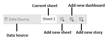
On launching it, the Tableau interface provides a list of ready data connectors which allows you to connect to any platform to load the data. Once, the data is pulled it is displayed on the screen. There are sheets in Tableau where the data cab be manipulated and visualisations can be created. Once all the visualisations are created they can be used to make a dashboard or a story to share. The users who receive the dashboards views the file using Tableau Reader.
Tableau interface on launching:

Tableau workbook screen:

The data from the Tableau Desktop can be published to the Tableau server. This is a platform where collaboration, distribution, governance, security model, automation features are supported. With the Tableau server, the end users have a better experience in accessing the files from all locations be it a desktop, mobile or email.
Microsoft Excel:
We are all familiar with Microsoft Excel and we know that it can easily work with a large number of data in tabular form. It has tools to make data manipulation easy. But this is not the only thing that can be done with Microsoft Excel, it also provides tools for visualisation of data.
We can easily plot graphs for a data present in tabular form. The steps are as follows:
Select the data to be represented as graphs and click on insert tab in the toolbar:

In the Insert tab, under the charts column select the type of chart you want to plot.

Here , we will plot a bar chart.
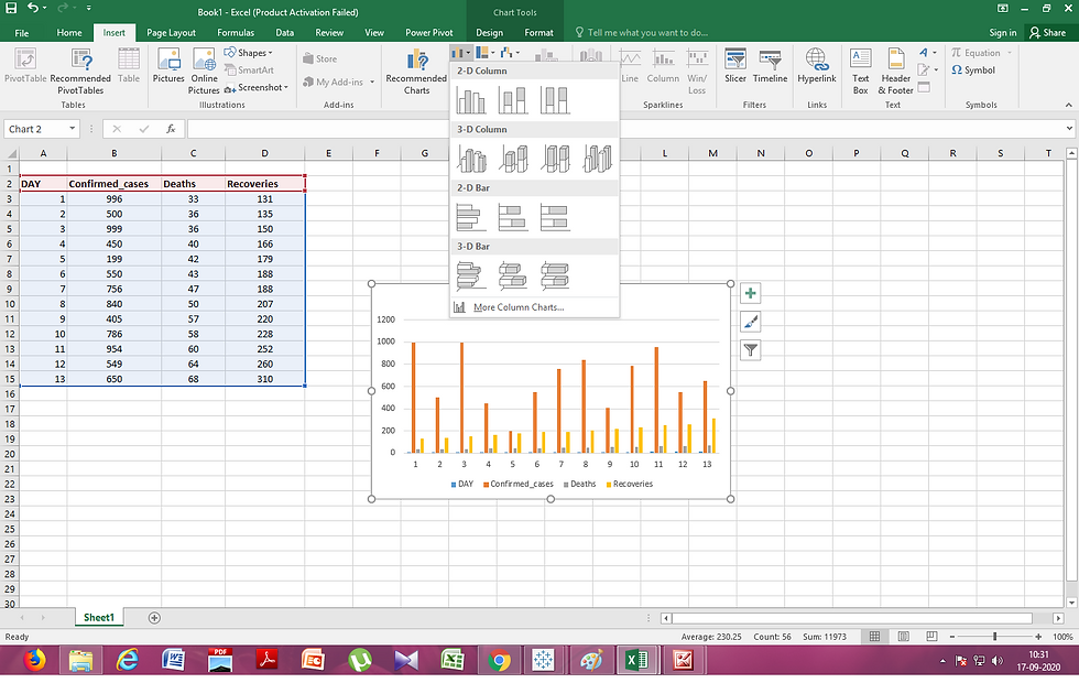
We can see that there are variations of bar charts available, similarly many options are available for other chart types as well. One can select any of the one available chart types as per their requirements.
Moreover, after plotting the chart we can modify its looks i.e. we can add chart titles, axis titles, we can change the colour scheme of the graphs, we can also change the scale of the graph, all this can be done by using the Design and Format Tab present under Chart tools in the toolbar or by using Chart Elements, Chart Styles and Chart Filters options present along with the chart.
Design tab:

Format tab:


Plotting graphs in excel is hassle free.
We can also produce dynamic graphs that can change values based on applied filters. It can be done by making a Pivot charts of the data and adding slicers and timeline to them.
Let us see an example:
Select the data to be inserted into a Pivot table:

In the insert tab, click on the Pivot table option in the Tables column. In the Create Pivot dialog box, select the new worksheet option if you want to create the pivot table in a fresh sheet or you can also choose the existing worksheet option if you want to create the pivot table in the same sheet, in this case you will need to provide the range of cells that would be needed to print to the pivot table. Click OK to create the Pivot table.


Select the elements for the rows and values column in PivotTable Fields dialog box to create the Pivot Table. After creating the pivot table. Select Pivot Charts option under Analyze Tab.

Select the type of chart you want to plot and click OK. The Chart will be displayed.


Select the chart and under the analyse tab select the Insert Slicer option in the filter column.

In the Insert Slicers dialog box, check the PivotTable Field for which you want to create a slicer. The slicer will be created. You can select one or multiple elements of the field to display the chart accordingly.

In this example we have created a slicer for the field Day, we can use the graph dynamically in the following way.

We can also add timeline to the pivot charts if our data consists of date and time. That way we can show the data for a specific date or time with just one click and in the same graph. No need to make different graphs for various cases.
Moreover, we can also connect the slicers and timelines to another charts as well given that the other charts have common fields in the same order.
Apart from such applications, there are several universal libraries that can be used in any programming language and are specifically made for Data Visualisation. We will now discuss a few of them.
Note: It is better to switch to Tableau because it can extract any type of data and can plot a lot of types of graphs. Excel lacks in variety of charts it offer.
ggplot2 ,ggplot and Plotnine
ggplot2 created by Hadley Wickham in 2005, is a data visualisation library for the programming language R whereas ggplot and Plotnine (created by Hassan Kibirige) are Python implementation of the The Grammar of Graphics (a general scheme for data visualisation which breaks up graphs into semantic components such as scales and layers.), inspired by the interface of the ggplot2 package from R.
The basic building blocks according to the Grammar of Graphics are:
data The data + a set of aesthetic mappings that describing variables mapping
geom Geometric objects, represent what you actually see on the plot: points, lines, polygons, etc.
stats Statistical transformations, summarise data in many useful ways.
scale The scales map values in the data space to values in an aesthetic space
coord A coordinate system, describes how data coordinates are mapped to the plane of the graphic.
facet A faceting specification describes how to break up the data into subsets for plotting individual set
If one has experience with ggplot2 then they can easily shift to plotnine or ggplot. The main goal of these libraries is to use less coding to produce high quality visuals.
It is worth mentioning that ggplot works well with pandas. So, if you're planning on using ggplot, it's best to keep your data in DataFrames.
The ggplot2 library can make simple to very complex graphs with univariate or multivariate numerical or categorical data. ggplot2 consists of two functions qplot() (quick plot ) and ggplot(). ggplot and plotnine libraries also use ggplot() function. The qplot() function can hide much of the complexity when creating standard graphs while ggplot() allows maximum features and flexibility.
To plot a graph with ggplot(), we must provide three features:
Data
Aesthetics: it describes how the columns of the data frame can be translated into positions, colors, sizes, and shapes of graphical elements.
Geometric objects (geom)
Let us look at an example:
from ggplot import *
diamonds.head()
ggplot(diamonds, aes(x='carat', y='price', color='cut')) +\
    geom_point() +\
    scale_color_brewer(type='diverging', palette=4) +\
    xlab("Carats") + ylab("Price") + ggtitle("Diamonds")
We used the diamond data set provided in ggplot to make the above plot.
You can look at the use of ggplot to create various graphs here: https://yhat.github.io/ggpy/
Matplotlib
Matplotlib was introduced by John Hunter in 2002. It is the main visualisation library in Python, all other libraries are built on top of matplotlib.
The library itself is huge, with approximately 70,000 total lines of code and is still developing. Typically it is used together with the numerical mathematics extension: NumPy. It contains an interface "pyplot" which is designed to to resemble that of MATLAB.
We can plot anything with matplotlib but plotting non-basic can be very complex to implement. Thus, it is advised to use some other higher-level tools when creating complex graphics.
Let us take a look at some examples:
Square function plot
from matplotlib import pyplot as plt
data = [x * x for x in range(20)]
plt.plot(data)
plt.show()
Sine function plot
import matplotlib
import matplotlib.pyplot as plt
import numpy as np

# Data for plotting
t = np.arange(0.0, 2.0, 0.01)
s = 1 + np.sin(2 * np.pi * t)

fig, ax = plt.subplots()
ax.plot(t, s)

ax.set(xlabel='time (s)', ylabel='voltage (mV)',
       title='About as simple as it gets, folks')
ax.grid()

fig.savefig("test.png")
plt.show()
import matplotlib.path as mpath
import matplotlib.patches as mpatches
import matplotlib.pyplot as plt

fig, ax = plt.subplots()

Path = mpath.Path
path_data = [
    (Path.MOVETO, (1.58, -2.57)),
    (Path.CURVE4, (0.35, -1.1)),
    (Path.CURVE4, (-1.75, 2.0)),
    (Path.CURVE4, (0.375, 2.0)),
    (Path.LINETO, (0.85, 1.15)),
    (Path.CURVE4, (2.2, 3.2)),
    (Path.CURVE4, (3, 0.05)),
    (Path.CURVE4, (2.0, -0.5)),
    (Path.CLOSEPOLY, (1.58, -2.57)),
    ]
codes, verts = zip(*path_data)
path = mpath.Path(verts, codes)
patch = mpatches.PathPatch(path, facecolor='r', alpha=0.5)
ax.add_patch(patch)

# plot control points and connecting lines
x, y = zip(*path.vertices)
line, = ax.plot(x, y, 'go-')

ax.grid()
ax.axis('equal')
plt.show()
You can look at the use of matplotlib to create various graphs here:
Seaborn
It is a library for creating statistical graphics in Python. It is built on top of matplotlib and integrates closely with pandas data structures. It is considered as a superset of the Matplotlib library and thus is inherently better than matplotlib. Its plots are naturally prettier and easy to customise with colour palettes.
The aim of Seaborn is to provide high-level commands to create a variety of plot types that are useful for statistical data exploration, and even some statistical model fitting. It has many built-in complex plots.
Let us take a look at some examples:
Plotting histogram and density function together
import seaborn as sns
import pandas as pd
import matplotlib.pyplot as plt

data = np.random.multivariate_normal([0, 0], [[5, 2], [2, 2]], size=2000)
data = pd.DataFrame(data, columns=['x', 'y'])

sns.distplot(data['x'])
sns.distplot(data['y']);
Plotting scatter plot
import seaborn as sns
import pandas as pd
import matplotlib.pyplot as plt
sns.set(style="darkgrid")

tips = sns.load_dataset("tips")


sns.relplot(x="total_bill", y="tip", hue="size", data=tips);
You can look at the use of seaborn to create various graphs here:
Working with ggplot is a better option as in a few lines of code we are able to produce complex graphics. Matplotlib and Seaborn should be used together to produce good graphics as seaborn is supposed to be a complement of matplotlib and not a replacement.


Comments